Step one for a GitHub like commit status check ui:


Step two:


The design now will list all commit status checks which takes too much
space.
This is a pre-improve for #26247
---------
Co-authored-by: delvh <dev.lh@web.de>
Co-authored-by: silverwind <me@silverwind.io>
Co-authored-by: wxiaoguang <wxiaoguang@gmail.com>
Currently this feature is only available to admins, but there is no
clear reason why. If a user can actually merge pull requests, then this
seems fine as well.

This is useful in situations where direct pushes to the repository are
commonly done by developers.

---------

Co-authored-by: delvh <dev.lh@web.de>
* Show checkout instructions also when there is no permission to push,
for anyone who wants to locally test the changes.
* First checkout the branch exactly as is, without immediately having to
solve merge conflicts. Leave this to the merge step, since it's often
convenient to test a change without worrying about this.
* Use `git fetch -u`, so an existing local branch is updated when
re-testing the same pull request. But not the more risky `git fetch -f`
in to handle force pushes, as we don't want to accidentally overwrite
important local changes.
* Show different merge command depending on the chosen merge style,
interactively updated.
- The review type '22' is a general comment type that is attached to
single codecomments, reviews with multiple comments or to simple approve
and request changes comment. This comment can be used to create a link
towards this action on an pull request.
- Adds an anchor to the review comment type, so that when its getting
linked to it, it actually jumps towards that event.
- This also now fixes the behavior that after you created a review you
will be redirected to that review and because this is an general comment
type other mails will also be 'fixed' such as the approved or request
changes.
- Resolves https://codeberg.org/forgejo/forgejo/issues/1248

(cherry picked from commit 1741a5f1fe)

---------

Co-authored-by: Gusted <postmaster@gusted.xyz>
Co-authored-by: Caesar Schinas <caesar@caesarschinas.com>
Part of #27065

This PR touches functions used in templates. As templates are not static
typed, errors are harder to find, but I hope I catch it all. I think
some tests from other persons do not hurt.
I think it's better if the primary actions have primary color instead of
green which fits better into the overall single-color UI design. This PR
currently replaces every green button with primary:

<img width="141" alt="Screenshot 2023-09-16 at 14 07 59"
src="843c1e50-4fb2-4ec6-84ba-0efb9472dcbe">
<img width="161" alt="Screenshot 2023-09-16 at 14 07 51"
src="9442195a-a3b2-4a42-b262-8377d6f5c0d1">

Modal actions now use uncolored/primary instead of previous green/red
colors. I also removed the box-shadow on all basic buttons:

<img width="259" alt="Screenshot 2023-09-16 at 14 16 39"
src="5beea529-127a-44b0-8d4c-afa7b034a490">
<img width="261" alt="Screenshot 2023-09-16 at 14 17 42"
src="4757f7b2-4d46-49bc-a797-38bb28437b88">

The change currently includes the "Merge PR" button, for which we might
want to make an exception to match the icon color there:

<img width="442" alt="Screenshot 2023-09-16 at 14 33 53"
src="993ac1a5-c94d-4895-b76c-0d872181a70b">
Close#27012
By the way, rename the single-word ID to a long ID.


1. Use `gt-invisible` instead of `invisible`.
2. Use `gt-word-break` instead of `dont-break-out` (there is a slight
different "hyphens", but I think it won't affect too much since it is
only used for the "full name").
3. Remove `.small.button:has(svg)` , now our buttons could layout SVG
correctly, and actually I didn't see this CSS class is used in code.
Each change is tested manually line by line. There are too many changes
so I can't share dozens of screenshots.

In short:

1. `ui right` could be still used in `ui top attached header`, because
there is a special case.
2. A lot of `ui right` are just no-op, so they can be removed safely.
3. Some of the `ui right` should be replaced by `gt-float-right` (to
avoid breaking, leave them to the future).
4. A few of the `ui right` could be rewritten by flex.
Fix#26731
Almost all "tabindex" in code are incorrect.
1. All "input/button" by default are focusable, so no need to use "tabindex=0"
2. All "div/span" by default are not focusable, so no need to use "tabindex=-1"
3. All "dropdown" are focusable by framework, so no need to use "tabindex"
4. Some tabindex values are incorrect (eg: `new_form.tmpl`), so remove them
Co-authored-by: Giteabot <teabot@gitea.io>
Removed CSS helper classes (some of them are not useful while some of
them are abused often)
* `gt-db`: in most cases it could be replaced by `gt-df` and the flex
layout should be encouraged. Other cases: either it does need the
`gt-df` (eg: by using `div` directly) or it is an abuse (eg: the warning
message in a form)
* `gt-di`: it doesn't seem useful, or it could be replaced by `gt-dib`
in most cases.
* `gt-dif`: not useful, it could be replaced by `flex-text-inline` or
`gt-df`
* `gt-js`: never used
* All `<i class="icon gt-df gt-ac gt-jc">` could be written as `<i
class="icon">`
## Some UI samples
### Admin Notice

### Admin Stacktrace

### Org Home

### Org Team Repo

### Release List

### User Setting Application Token Scope

Co-authored-by: Giteabot <teabot@gitea.io>
We are using `<a>` for commit status check icon with no link. So it is
clickable but this is no sense.
I think we can convert this to `div`.

Co-authored-by: Giteabot <teabot@gitea.io>
Closes#26263
We have to pass the date without the time.
# Before

# After

Signed-off-by: Yarden Shoham <git@yardenshoham.com>
I find the colored buttons in the issue sidebar distracting, given that
they are not primary actions, I think we can de-colorize them.

Before:
<img width="285" alt="Screenshot 2023-07-26 at 19 42 22"
src="7e784805-4e01-4199-94bb-0538a0130264">
<img width="288" alt="Screenshot 2023-07-26 at 19 43 06"
src="3a89c661-e24a-4ebf-a585-d404d0a6a78a">
<img width="285" alt="Screenshot 2023-07-26 at 19 44 36"
src="c1aa8c13-6f41-4763-8149-d1c07cb4be5c">:

After:
<img width="286" alt="Screenshot 2023-07-26 at 19 42 04"
src="74d640c2-e0ab-4fef-87aa-9e788e9010e2">
<img width="285" alt="Screenshot 2023-07-26 at 19 42 51"
src="3b69976a-9aa4-4e1c-8df3-4168f4a9fcf9">
<img width="286" alt="Screenshot 2023-07-26 at 19 45 15"
src="897222fd-4df2-4d99-98eb-e5f8fb77c4d6">
This problem occurs because in #25839, the warning status has been
removed, but there is something in the tmpl that hasn't been changed.
related #25839close#26118
Should look exactly like before for normal dividers. "Horizontal" ones
look better because they no longer use image backgrounds.

<img width="917" alt="Screenshot 2023-06-27 at 19 07 56"
src="d97d8dec-6859-44a8-85ba-e4549b4dd9df">

<img width="914" alt="Screenshot 2023-06-27 at 19 05 58"
src="8bf98544-2d82-4ebf-ac68-d6dc237bd6b2">

<img width="1246" alt="Screenshot 2023-06-27 at 19 00 42"
src="36a6bb21-6029-4f53-8bee-535f55c66fed">

<img width="344" alt="Screenshot 2023-06-27 at 18 58 15"
src="a9e70aee-8e6b-4ea1-9e93-19c9f96aec6e">
<img width="823" alt="Screenshot 2023-06-27 at 18 56 22"
src="e7a497cd-f262-4683-8872-23c3c8cce32f">

<img width="330" alt="Screenshot 2023-06-27 at 19 21 11"
src="42f24149-a655-4c7e-bd26-8ab52db6446b">
Before:

<img width="364" alt="Screen Shot 2023-06-20 at 11 59 11"
src="ad284b7e-8d21-43be-b178-bbcfd37cb5bd">

Might trigger many posts when keep clicking the buttons above.

<img width="448" alt="Screen Shot 2023-06-20 at 11 52 28"
src="a60aa6ac-af74-45e4-b13a-512b436b81b0">
<img width="678" alt="Screen Shot 2023-06-20 at 11 52 37"
src="d6662700-3643-4cc7-a2ec-64e1c0f5fbdb">

After (PR sidebar, Same for issue):


9df3ad1f-e29c-439b-8bde-e6b917d63cc6

For delete, it is using `base/modal_actions_confirm` subtemplate, and we
might need another general solution for this (maybe add another
attribute to the subtemplate or something)

---------

Co-authored-by: silverwind <me@silverwind.io>
Co-authored-by: Giteabot <teabot@gitea.io>
Co-authored-by: wxiaoguang <wxiaoguang@gmail.com>
this will allow us to fully localize it later

PS: we can not migrate back as the old value was a one-way conversion


prepare for  #25213

---
*Sponsored by Kithara Software GmbH*
If enabled show a clickable label in the comment. A click on the label
opens the Conversation tab with the comment focussed - there you're able
to view the old diff (or original diff the comment was created on).
**Screenshots**


When resolved and outdated:

Option to enable/disable this (stored in user settings - default is
disabled):


fixes#24913
---------
Co-authored-by: silverwind <me@silverwind.io>
So I found this [linter](https://github.com/Riverside-Healthcare/djlint)
which features a mode for go templates, so I gave it a try and it did
find a number of valid issue, like unbalanced tags etc. It also has a
number of bugs, I had to disable/workaround many issues.

Given that this linter is written in python, this does add a dependency
on `python` >= 3.8 and `poetry` to the development environment to be
able to run this linter locally.

- `e.g.` prefixes on placeholders are removed because the linter had a
false-positive on `placeholder="e.g. cn=Search"` for the `attr=value`
syntax and it's not ideal anyways to write `e.g.` into a placeholder
because a placeholder is meant to hold a sample value.
- In `templates/repo/settings/options.tmpl` I simplified the logic to
not conditionally create opening tags without closing tags because this
stuff confuses the linter (and possibly the reader as well).
Fix#25133
Thanks @wxiaoguang @silverwind.
I'm sorry I made a mistake, it will be fixed in this PR.
---------
Co-authored-by: Giteabot <teabot@gitea.io>
Co-authored-by: silverwind <me@silverwind.io>
Fixes https://github.com/go-gitea/gitea/issues/25130

The old code uses `$(this).next()` to get `dismiss-review-modal`.
At first, it will get `$(#dismiss-review-modal)`, but the next time it
will get `$(#dismiss-review-modal).next();`
and then `$(#dismiss-review-modal).next().next();`.
Because div `dismiss-review-modal` will be removed when
`dismiss-review-btn` clicked.

Maybe the right usage is adding `show-modal` class and `data-modal`
attribute.
View diff:
https://github.com/go-gitea/gitea/pull/24738/files?diff=unified&w=1

Improve layout and functionality in review area:

<img width="439" alt="Screenshot 2023-05-15 at 20 10 01"
src="be10452b-5829-4927-8801-7b26a57b3dbd">

Remove the "Reviewers" timeline box that appears before the merge box.
it's a duplicate of the top-right review area and all functionality of
it has been moved to the other box:

<img width="868" alt="Screenshot 2023-05-15 at 19 39 31"
src="35489445-e54b-40d3-b3cf-38d029478f96">

Increase timeline item vertical padding from 12px to 16px:

<img width="449" alt="Screenshot 2023-05-15 at 19 43 50"
src="919c4f9d-a485-4f51-b08c-2c0fc714a413">

---------

Co-authored-by: Giteabot <teabot@gitea.io>
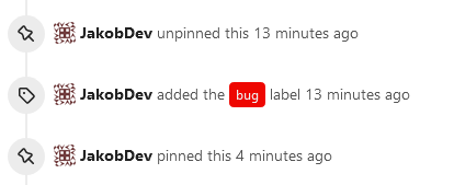
This adds the ability to pin important Issues and Pull Requests. You can
also move pinned Issues around to change their Position. Resolves#2175.
## Screenshots
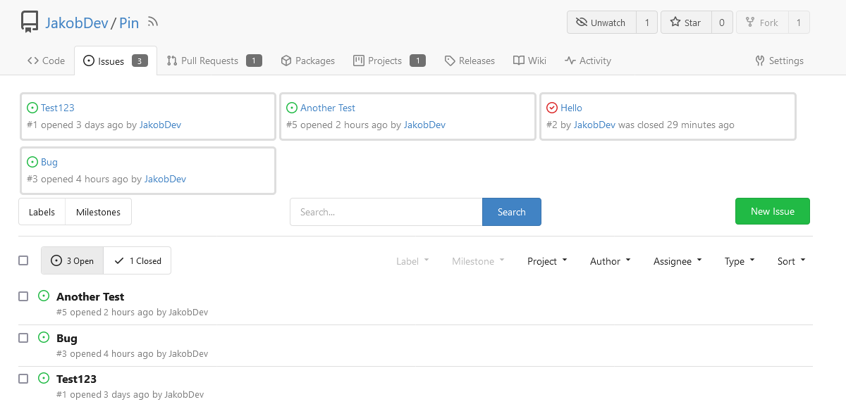
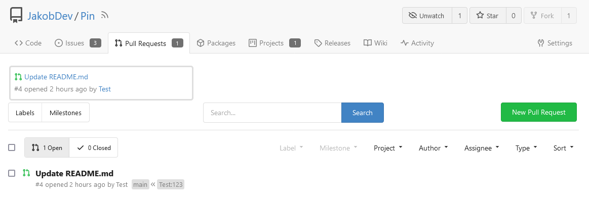
The Design was mostly copied from the Projects Board.
## Implementation
This uses a new `pin_order` Column in the `issue` table. If the value is
set to 0, the Issue is not pinned. If it's set to a bigger value, the
value is the Position. 1 means it's the first pinned Issue, 2 means it's
the second one etc. This is dived into Issues and Pull requests for each
Repo.
## TODO
- [x] You can currently pin as many Issues as you want. Maybe we should
add a Limit, which is configurable. GitHub uses 3, but I prefer 6, as
this is better for bigger Projects, but I'm open for suggestions.
- [x] Pin and Unpin events need to be added to the Issue history.
- [x] Tests
- [x] Migration
**The feature itself is currently fully working, so tester who may find
weird edge cases are very welcome!**
---------
Co-authored-by: silverwind <me@silverwind.io>
Co-authored-by: Giteabot <teabot@gitea.io>
There was some recent discussion about this in Discord `ui-design`
channel and the conclusion was that
https://github.com/go-gitea/gitea/issues/24305 should have fixed their
OS font installation to have semibold weights.

I have now tested this 601 weight on a Windows 10 machine on Firefox
myself, and I immediately noticed that bold was excessivly bold and
rendering as 700 because browsers are biased towards bolder fonts. So
revert this back to the previous value.
Clean up a few cases where avatar dimensions were overwritten via CSS,
which were no longer needed or were possible to set via HTML width.

Also included are two small fixes:

- Fix one more case of incorrect avatar offset on review timeline
- Vertically center avatars in review sidebar

There is more to be done here, but some of the work depends on Fomantic
`comment` module removal, or in the case of org member lists, a refactor
of the `avatarlink` template to accept a size.

<img width="371" alt="image"
src="9c5902fb-2b89-4a7d-a152-60e74c3b2c56">
<img width="306" alt="image"
src="c8d92e2a-91c9-4f4a-a7de-6ae1a6bc0479">

---------

Co-authored-by: Giteabot <teabot@gitea.io>